CLIENT:
24|7 Nursing & Medical Services
PROJECTS:
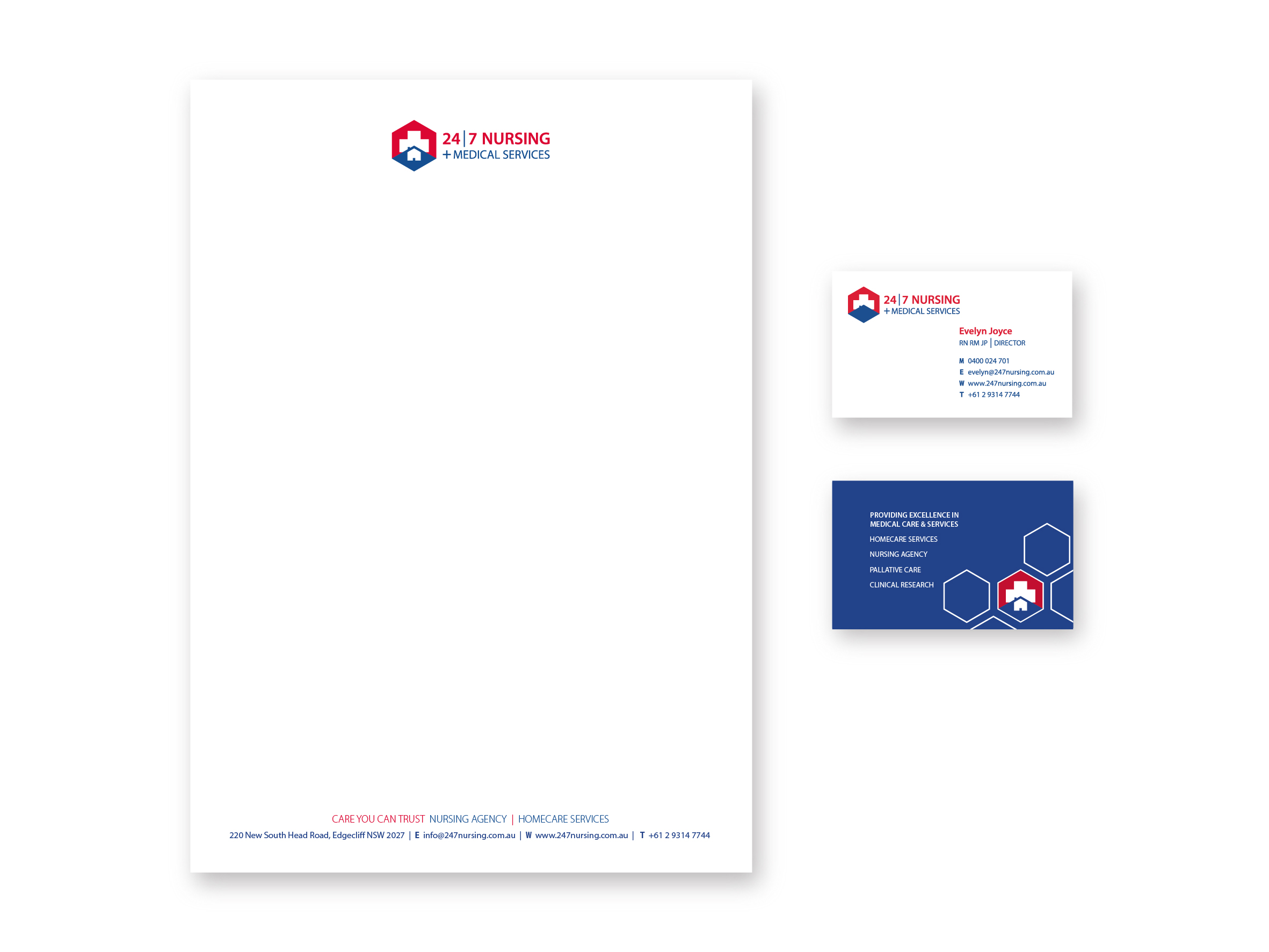
Branding | Website | Design | Print | Signage
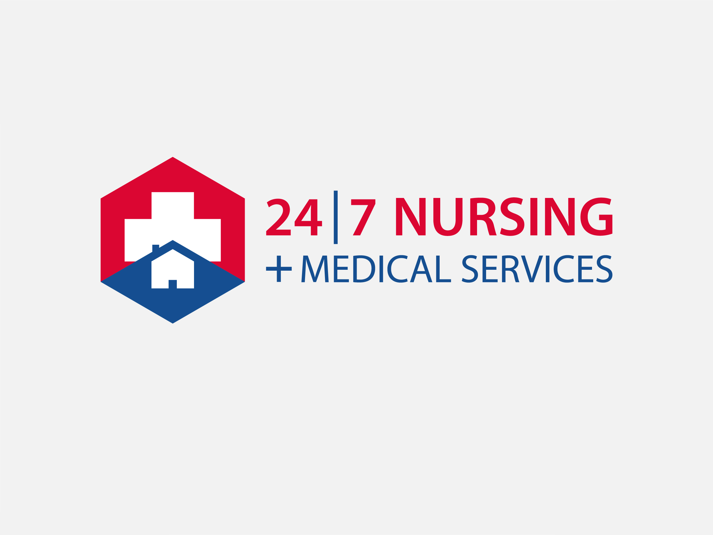
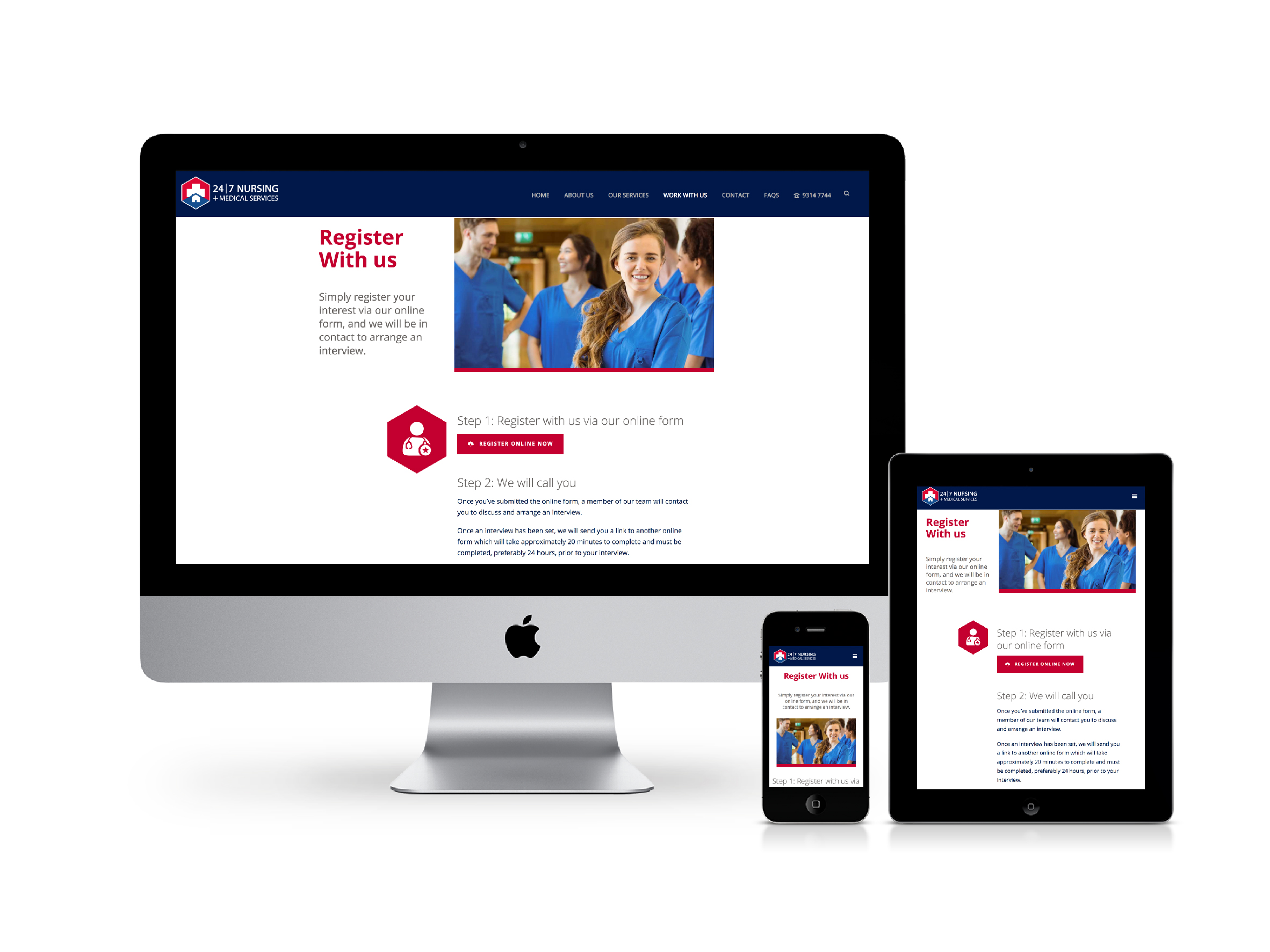
24|7 Nursing is a major provider of nursing healthcare services across several industries from public & private hospitals through to clinical research, private nursing and homecare services. Their original logo was 13 years old and needed updating to better represent the scope of their business. It was important to keep the cross for both continued brand awareness and symbolism of medicine and healing. The colours and shapes therefore formed an important part of the design process. A hexagon, which is the principal governing pattern in the natural world was used to represent communication, union, balance, efficiency and community.
The top section of the logo symbolises the hospitals and other large healthcare facilities, while the lower section of the logo symbolises the Home Care and Private Nursing Services.
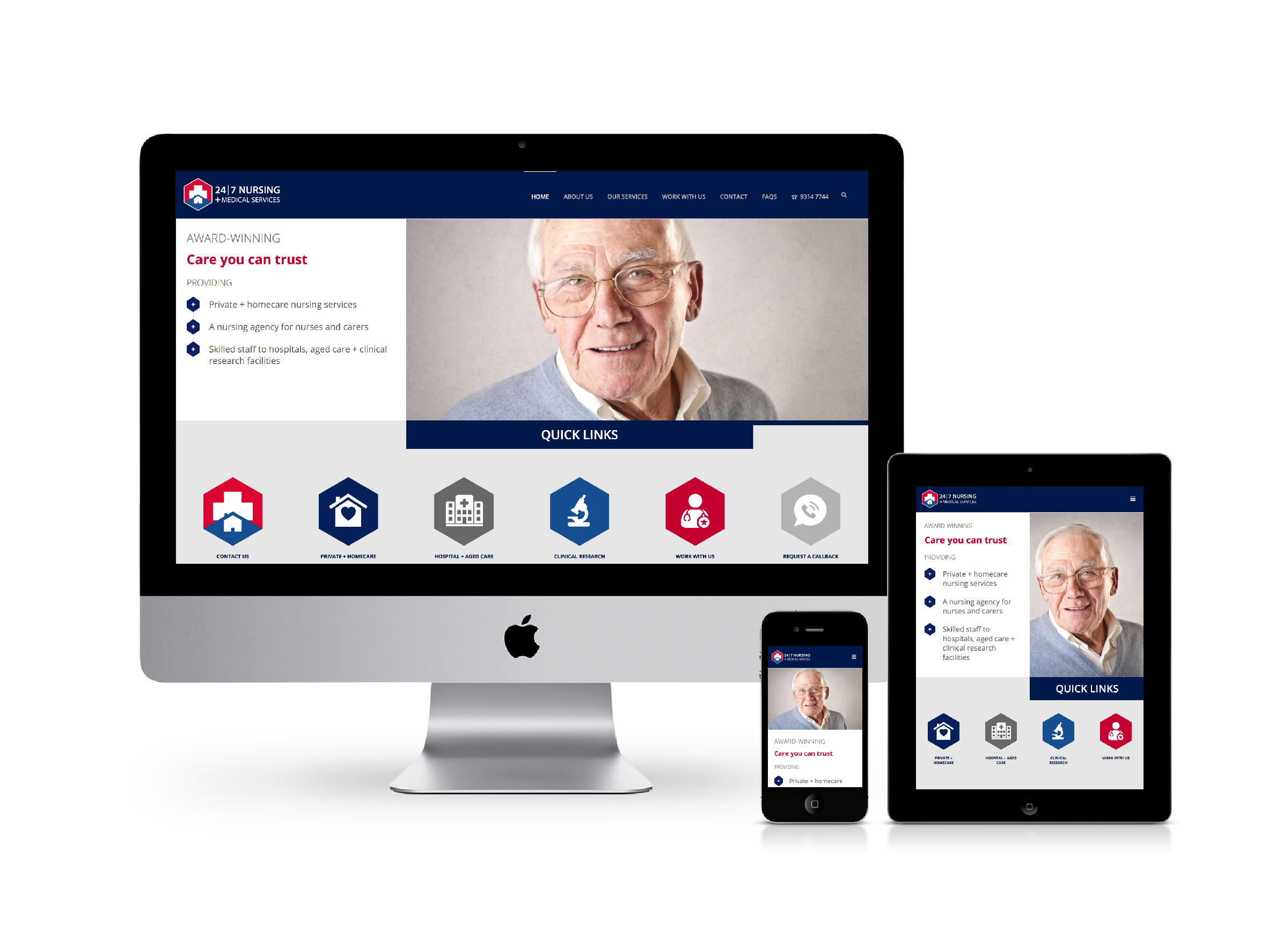
The new branding and website have been a resounding success for 24|7 NMS, reporting new clients have sourced their services due to their professional online presence.