CLIENT:
Women In Law & Business
PROJECTS:
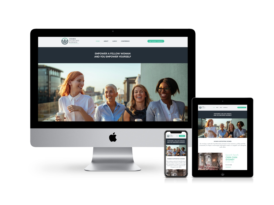
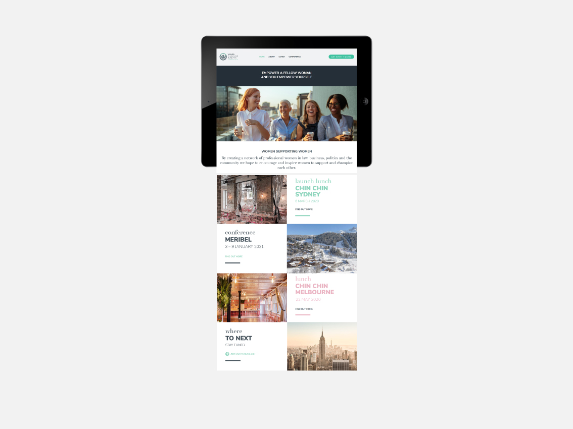
Branding | Website | Design | Print
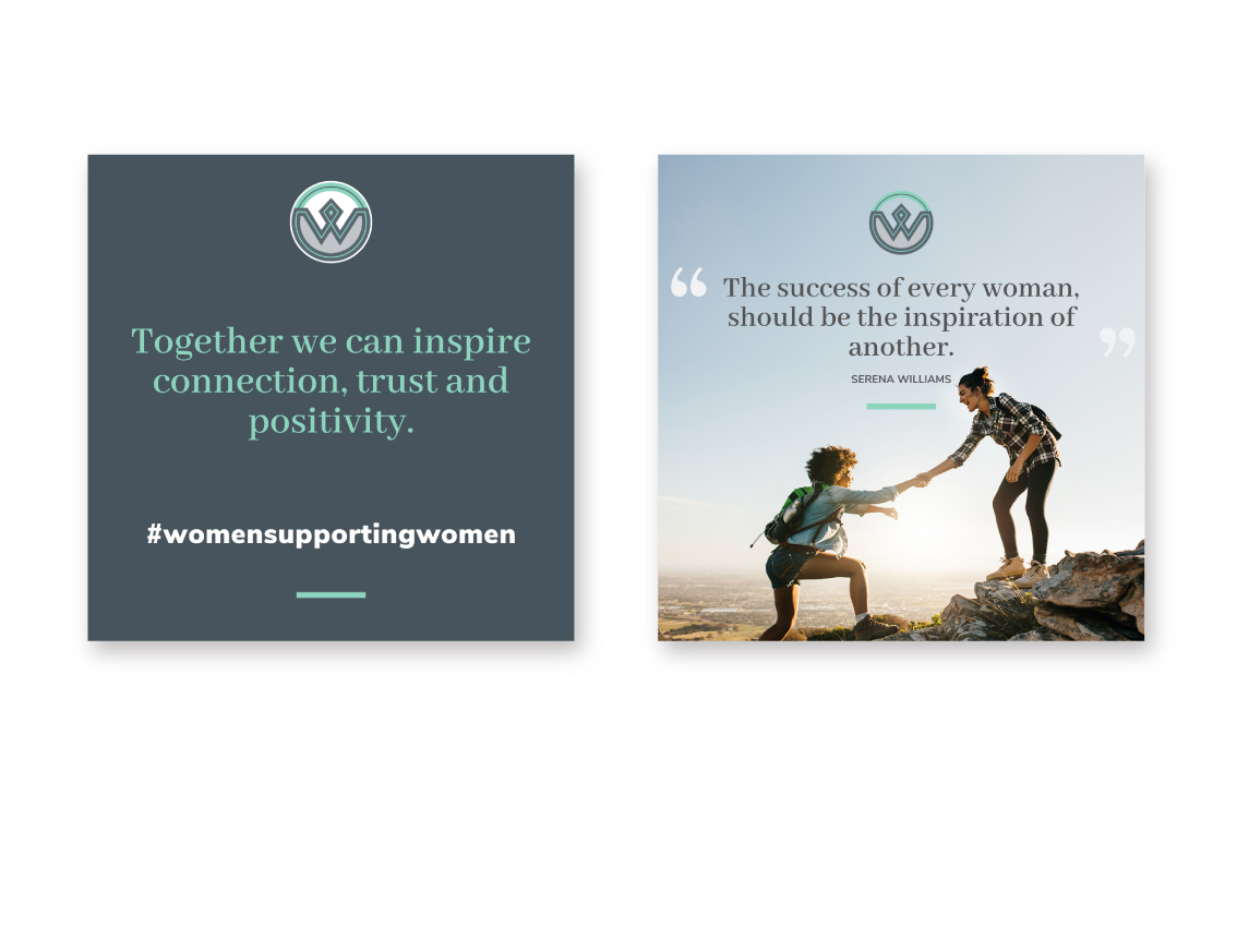
A professional network of women in law, business, politics and the community, inspiring women to support and champion each other.
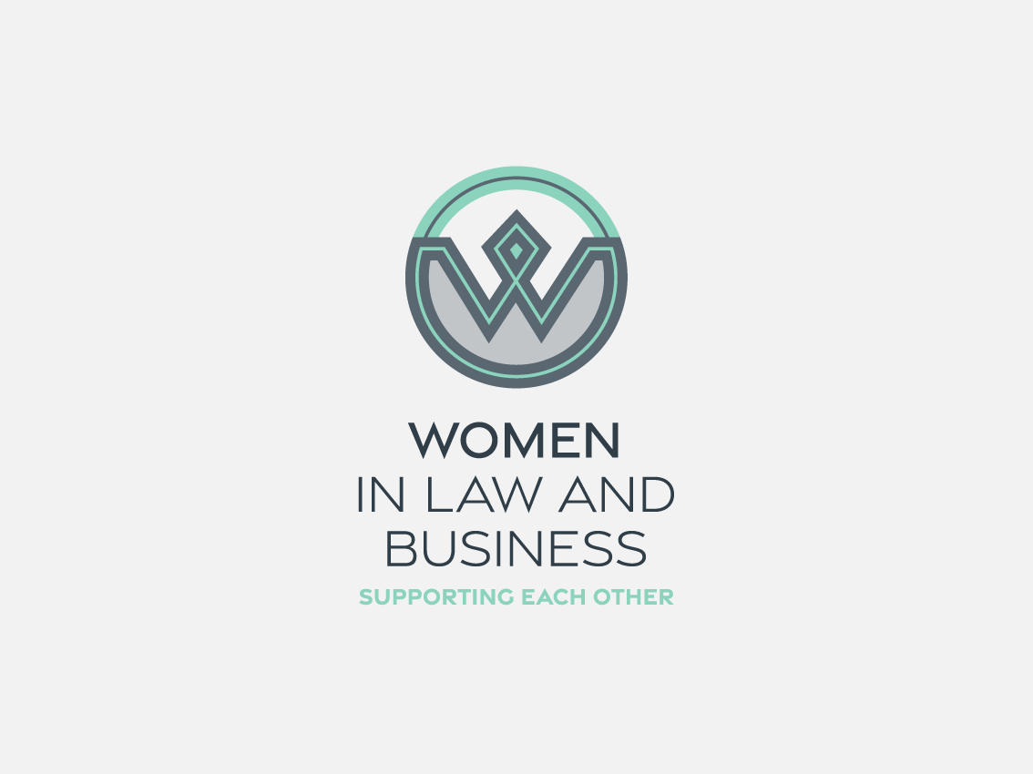
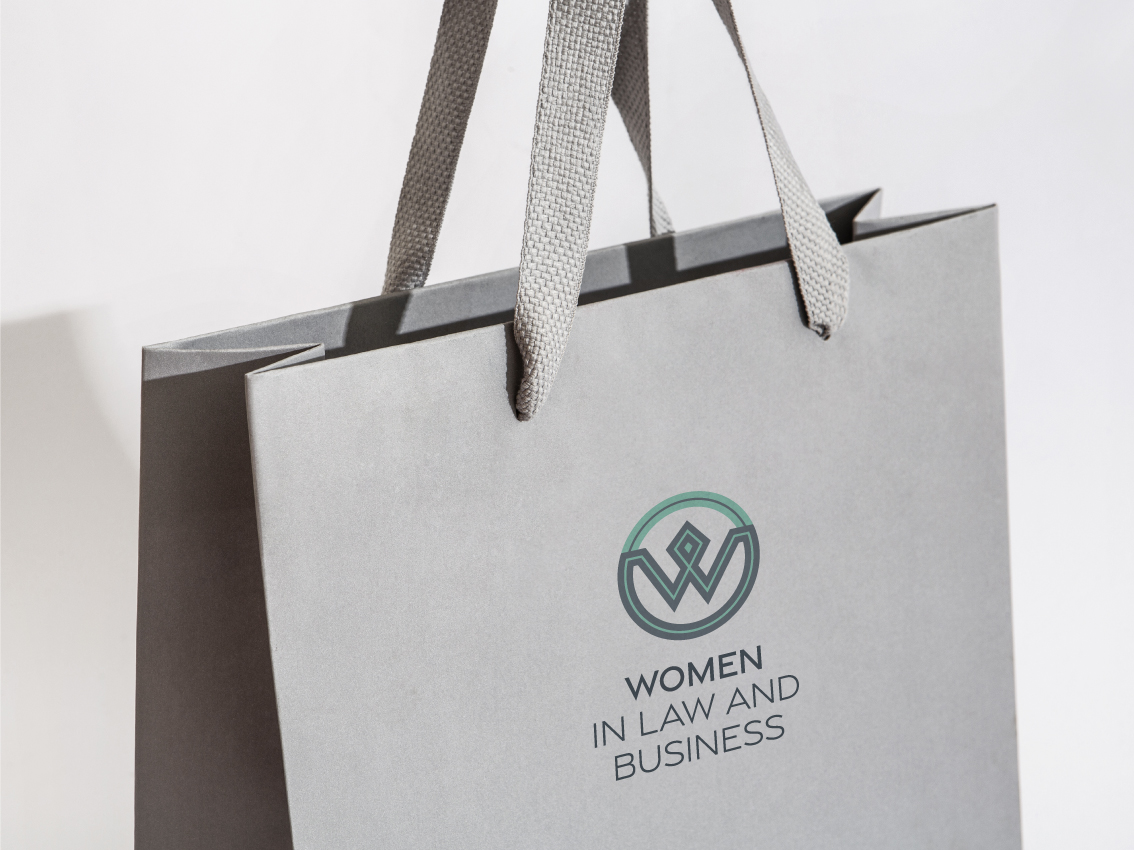
The logo is built from an enclosed circle, denoting strength and unity. There are two “W” letters, of varied thickness and colour representing our differences while the layering of those letters represent how women are multi-dimensional.. The broken layer of the outer circle represents how sharing our stories we reveal our true colours and inspire others. The interconnected shapes represent networking while the resulting diamond symbolises how working together…we are stronger.

